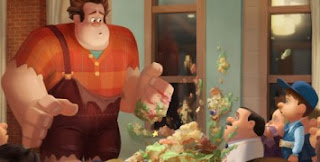
Wreck-it Ralph has also been a massive influence in my game module, although it is not a game... it is a 3D animation exploring the world of games.
The world of Fix-It Felix Jr, where Ralph the main protagonist lives and works, has been designed with the 8-bit game mode in mind, where when in the game world it still retains the square format in design, even going down to the very fine details such as making the dust clouds square shaped.
I really love how the concept art for the station is clearly linked to the final rendered animated version below, with very little elements in design being changed, and stylistically remaining the same. I love the use of light in the final version, especially with the reflections on the floor. When researching for this module, I am finding the use of lighting more and more important, and my desire to have a well lit game more important to me, as it can completely change the emotions and mood.
Although not particularly the style I would wish my own work to be in, I love the depth and motion in these pieces of concept art for the Hero's Duty game in the film. The use of colour and symbolism behind the colours used is also interesting, as well as the key shapes being triangles, showing sharp and harsh edges implying the danger in the game.
I was unable to find many pieces of Vanellope's hideen living space, and the added bonus round of the Sugar Rush game, but the one image I did find I think is breathtaking. The contrast between the warm tones from the lighting of the 'lava' at the bottom to the cool whites and blues from the mentos above with the blend in the middle is perfect. The difference between the silhouette shapes of the two characters are also gorgeous and well lit.
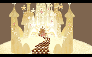
The main environment for the film was Candy Kingdom for the Sugar Rush game. I find it amazing how well the environment concept artists have got to the finished idea of the environment, with often the concept art looking as if it is a screen shot from the actual film. I love the roundness of everything, with the smooth curved line work, differing to the squares and triangles of the other games.


No comments:
Post a Comment