Showing posts with label OUDF403 - Fundamental Skills for Film Games and Animation - Set. Show all posts

Wednesday, 30 January 2013

Sketch-up version of my environment

As my character is a sealmaid, she is half the size of the human shown on the scale, showing that this house is quite small. After creating my concept artwork and basic layout shape I was able to create a similar version using Google Sketchup, to make an outline.

From looking at the concept art, I added in the walls to the various rooms, changing some of the shapes slightly. I really like the unusual spaces created, yet it still sticks to the traditional Japanese housing layout.

I was then able to raise the sections of the bedrooms up higher than the entrance to show that those rooms are further inside the cave allowing air to flow inwards and stop the water coming in. As this is my first time using Google Sketchup, I wasn't sure how to create walls and a roof, but as a general floor plan I think that this shape explains my idea well.

Here is the measured version, however some measurements are the length of the sides rather than across the rooms. But this gives a general idea of how large the environment is.

Final Environment concept artwork

After doing some concept sketches, I scanned some of them in to turn into more finished pieces of concept work, and colour them on photoshop.

I started off thinking about the Japanese floor plans, and the importance of that layout, and then drew out a rough weird cave shape, which I then adapted these ideals around. I purposely wanted smooth curves and rounded shapes to play a big part in her living space, especially after looking at the mood board I produced of the futuristic looking water houses. As it is in a cave I still wanted to keep the natural looking aesthetic, with the walls staying as rook (other than her bedroom which she has plastered and painted to be more like a human girls bedroom). In this image you can also see the entrance into the cave and out to the ocean. That hallway would always be flooded as it is on a lower level to the main rooms, which you have to swim up to, and are above water level. However in high tide the cave fills up, so all furniture and appliances are adapted to be able to withstand both conditions.

After doing the floor plan I thought it was important to show where the doors are, as well as the key furniture pieces, which allows you to understand the scale of each room.

I felt it was important to create a human-like kitchen, even if she would be unable to use some of the appliances. I also wanted to keep it in the same aesthetic as the rest of the house, but more toned down. I particularly wanted to show that the kitchen has been adapted to fit the space they have, which is why they have a curved kitchen workspace.

This piece of concept work shows the outside of her house, with the hole opening into the sea. As it is a piece of rock with a large space underneath (so it is resting above the sea bed), it was important to show it in relation to the environment around it. The rock housing my characters is attached to a cliff, which would be to the left of the image shown.

This was my first piece of concept artwork I created for this project, and the one I am post proud of. I really enjoyed designing this room, and had good fun laying this room out and carefully choosing what my character would choose to own.

Development of final concept art pieces

My character Shishi, is a sealmaid (seal crossed with a mermaid) but she despirately wants to live like humans do, which is reflected in her choice of housing and in particular I found her bedroom would be important. As she is still a young girl, and finding herself, style and personality wise, I thought it was important to keep her room 'young looking' with lots of toys, and funny/interesting knick knacks based on real things I have found on sale on online craft shops such as Etsy. 


I then started adding base layers down, and changed the opacity, to give interesting washed out tones.

Because all of the opacity has been changed, when any other details or colours are added on separate layers, it gives a really nice overlapping colour, and adds to the aesthetic I feel my character would have. She is a colourful character, and lives under the sea in a cave, which I feel matches these colours well. I have tried to keep the colours, shapes and objects to be soft and warm.

Once the background layer of my initial sketch is removed, you can see the effect I am going for my using this method. Although this image is whilst it is still in the development stages, I think it shows my thought process behind creating an environment specific to my character, and her personality.

Here is the final piece of concept artwork for Shishi's bedroom.

Floor plan examples

Before designing the environment that my character will be living in, I looked at a few floor plans for ideas on how to arrange her space.

On the website http://www.facebook.com/Japan.Art.Architecture I found this image of the typical layout for a Japanese house. As my character is Japanese and still living there this is a really useful floor plan to refer back to. Layout wise I can use the same room structure, but manipulate the space and sizes to suit my characters living needs (such as making the shapes more curved to show that it is inside a cave). 


When borrowing Chris' 'Making of Totoro' book I found this beautifully planned out floor plan of the main characters house and how it relates to part of their garden. Although it is unclear from this which room is which (as it is written in Japanese) , you can guess some of the rooms, and I have taken on the unusual shape. As this is a Japanese film it is really relevant to my own personal set again.

I struggled to find any more floor plans which were completely relevant to what I was searching for, but I came across these three pieces of fan art created by the same group of people. What they do is try to figure out the shape of famous films and series' housing or buildings, and recreate them in a floor plan style. Although this is working backwards, and not 100% what I am looking for, I find it really interesting to see the unusual shapes used and created, often due to the limitations of space when filming, giving weird and unusual angles. These three in particular are my favourites, not only because they are shows that I personally watch, but due to the interesting layouts


Colour Palette

After creating my first piece of environment finished concept artwork I was interested to find out what colours and how many I used in that one piece and make a colour palette for future pieces in this project. I was so surprised with my vast amount of colour choices as I didn't realise how many I had used!!


Friday, 25 January 2013

Environment mood board

Here is a mood board I created from images I found in a few water architecture books, which are the structure, style and texture of housing I wish my character to live in. I want it to be an unusual shape, but use natural texturing of elements you would find in the ocean such as rock, minerals and bubbles.

The images came from these books:
Water house. / Burchard, Christian  &  Flesche, Felix  (2005)
Water. / Knechtel, John  (2009)
Water, wasser, eau. / Fischer, Joachim (ed.)  (2008)

Thursday, 17 January 2013

Environment art 5/5

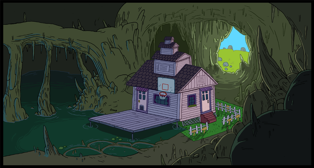
Adventure Time is one of the most popular cartoons currently being shown on Cartoon Network, mainly due to its hilarious storylines and random characters (a shape shifting dog, a lumpy space princess and a teleporting frog to name a few). However saying this, the animations wouldn't be as popular if the vast amount of settings weren't there, and if the environment didn't flow and match the animation style.

I really like the smoothless of their lines, the difference in colour palette for each environment, the tones used to show lighting and give more depth, the small details, and the imaginativeness that must have went into producing these images. 


Environment art 4/5

Studio Ghibli, 'The Japanese Disney' as they are often known, have a very distinctive style and always have really interesting ideas for narratives, making them appealing to audiences world wide. Out of all animations I have seen (which is a fair few..), Ghibli by far has the most magnificent and detailed scenery. Whether this scenery is the inside of a changing walking house, luscious green Japanese country side or a traditional Japanese market, it captures the area's culture and feeling perfectly.

I was lucky enough to borrow three books from Chris, looking at three of the studio's individual films, focusing on the concept art and how the film was made as well as some stills from the films themselves.  The follow images are taken from these three books, so apologies for quality issues (due to them being scanned images).

Howls Moving Castle
I can't stress enough how much I love the speckles on the walls and the floorboards and the lighting and the colours in this. They are so real and believable. The tones in them too, really give the mood of the different segments of the animation, and relate the the storyline, reflecting the narrative.

As well as liking this particular style of drawing, and representation, I really love how they have drawn out a floor plan of the room, showing where everything is, in relation to everything else. I also like the labeling of each item in the room (especially of the table), which I personally think is a really clever idea, as you won't forget to draw something in if you change the camera positioning in the animation. The final thing I love about this page is the drawings of the door. If you have seen the film, you will understand the importance of this door and how it changes according to where the dial is, so to see the sketches of the door in the different places really excites me!

These beautiful paintings are just another example of the studio's amazing patience and skill in creating such life like and believable settings. By doing this, it doesn't matter how 'cartoon like' their characters are, allowing you to focus on the narrative more.

Here are some images, and close ups of the exterior of the castle. I find it amazing how they manage to assemble so many random parts together, to create this living monster of a building. It really is the most imaginative living space I think that has ever been animated, and I adore it in every way. Every rusty bolt, and it's chicken legs, to the door in which turnip head stood by, I cannot believe how they assembled such a masterpiece together.

Spirited away

This image really moves me, in ways I can't describe. I remember first seeing this environment when watching Spirited Away for the first time, and being in ore at how they manage to light it so perfectly from the lanterns to the reflections on the floorboards, and the detail in the windows and roof tiles, and behind the bar. I was speechless. I think it is amazing was an animation can do, and even more so what a still image can do. And I wish to capture this essence and use it in my own work.

I really love the colour and roughness around the edges in these images, and although there is very little that indicates the location of these buildings, you can still feel that they have a Japanese heritage, which I find really interesting.

 I find it really interesting to see how they have drawn out floor plans to express the layout of the building, but then gone into drawing it in different perspectives, showing that they have a really good understanding of animating in 3D space, as well as fundamental drawing skills.

I find this image so striking. Not only because this style of architecture fascinates me, but the attention to detail, especially in the line work which has worked into the block colour. The sky in this image also really draws you in, and you feel as if you are really there looking up at this amazing building. What I love about Ghibli, is that they stay true to what they know, and their heritage and culture, and bring these elements into their work. For my animation I would love to do a similar thing, especially as I am hoping to create a Japanese character, however I feel I don't understand enough of their culture to do it justice, and will only focus on small elements in my design work.

Totoro

 I love these beautiful water colours, which show the characters interaction with their environment, especially their feet in the grass in the first image, and how it looks composition wise. I also really love the reflections in both images, making it feel more 'real'.

Who can argue that these images are not beautifully stunning. I cannot believe the attention to detail, they really are masterpieces in their own right. I really like the use of lighting to reflect different moods in each image, and the amount of thought that has gone into the perspective and what is in the distance.

This is my favorite image by far, depicting Totoro asleep in his cave. The moss looks incredible, due to the lighting, shading and tonal work which has gone into the detailing of this picture. The texture and shape of the space itself also make this a wonderful environment to look at. I think this image will probably be the most useful for me to take reference from when creating my characters environment as I am hoping to create a cave house.

Like the last image, these show Totoro's cave, but this time from a different view point. I like how they have shown the 'before and after' as it were, from concept art to screen, to show how the space has been adapted and changed, but still stays true to the original concept.


Sunday, 18 November 2012

Environment art 3/5

In-Between is a French animation which tells the charming story of a woman's search for love, but she has one main obstacle... in the form of a pet crocodile (as you do). I adore the styling used for the characters, but equally love the matching style of the environment and how well it really works together. Everything has been really well planned out, the positioning of furniture down to how shots through the doorway would look. Underneath is one of their 'making of' video's, which goes more into the concept art and development of the environments used.

making of inbetween from blopOoO on Vimeo.

Below you can see how the character interacts with the environment.


To view the final animation (which I strongly recommend you do!) I have posted the video underneath.

In-Between from Team In-Between on Vimeo.

To look at the wonderful makers blogs for more pretty pictures of their work (and more behind the scenes work from In-Between), then here are a bunch of links!
http://inbetweenlefilm.blogspot.co.uk/
http://lenathemaraudeuse.blogspot.fr/
http://turlutuchu.blogspot.fr/
http://sumi-book.blogspot.fr/
http://juliettelaurent.blogspot.fr/

http://smart-katz.blogspot.fr/

Saturday, 3 November 2012

Environment art 2/5

Paranorman, as mentioned before, is one of my favourite films of all time, which is a steep thing to say seeing as I have only watched it once! The art direction is phenomenal. I was going to post about their character design work in my last set of blog posts, but I was far more impressed with the set design.

The main thing I love about Paranorman is the rooms which are cluttered and messy, such as Norman's bedroom clustered with zombie posters and toys, or his Uncle Pendergast's whole house which is even more cluttered (I especially like his desk with cut outs plastering the wall).

Here is a concept drawing of Norman's room by Ross Stewart and Trevor Dalmer

Now compare this amazing illustration to the fantastic job that the set designers did in creating the bedroom for the film. I really love the 50's horror style of drawing, especially of the 'mondo zombies' poster below.


This video shows how impressive this whole design and making process is.


This little light, was a big task. Every single thing you see on set has been made from scratch to keep the aesthetic all the same. I really like how in this video you see the whole journey it takes just to create one tiny item.
ParaNorman This Little Light from Grow Film Company on Vimeo.

Unfortunately there are not many concept drawings posted on the internet yet for Paranorman. I do however own 'The art and making of Paranorman' book, so when my scanner is fixed/I next have time I will hopefully post some of the drawings in there. It is well worth buying the book, it is filled to the brim with inspiration. However I did find this one on the internet!

Environment art 1/5

The first environment I thought I would research into was Disney Pixar's Ratatouille as I really loved the French architecture and rustic style of drawing in the concept artwork.

I found it really interesting to watch this video and see how real life still holds such a strong influence when designing any environment.


These are concept drawings by Dominique Louis. I adore his use of colours and understanding of lighting, it makes these images so much more believable.


I also found these concept images for Ratatouille, taken from the 'making of' book.