I was lucky enough to borrow three books from Chris, looking at three of the studio's individual films, focusing on the concept art and how the film was made as well as some stills from the films themselves. The follow images are taken from these three books, so apologies for quality issues (due to them being scanned images).
Howls Moving Castle
I can't stress enough how much I love the speckles on the walls and the floorboards and the lighting and the colours in this. They are so real and believable. The tones in them too, really give the mood of the different segments of the animation, and relate the the storyline, reflecting the narrative.
As well as liking this particular style of drawing, and representation, I really love how they have drawn out a floor plan of the room, showing where everything is, in relation to everything else. I also like the labeling of each item in the room (especially of the table), which I personally think is a really clever idea, as you won't forget to draw something in if you change the camera positioning in the animation. The final thing I love about this page is the drawings of the door. If you have seen the film, you will understand the importance of this door and how it changes according to where the dial is, so to see the sketches of the door in the different places really excites me!
These beautiful paintings are just another example of the studio's amazing patience and skill in creating such life like and believable settings. By doing this, it doesn't matter how 'cartoon like' their characters are, allowing you to focus on the narrative more.
Here are some images, and close ups of the exterior of the castle. I find it amazing how they manage to assemble so many random parts together, to create this living monster of a building. It really is the most imaginative living space I think that has ever been animated, and I adore it in every way. Every rusty bolt, and it's chicken legs, to the door in which turnip head stood by, I cannot believe how they assembled such a masterpiece together.
Spirited away
This image really moves me, in ways I can't describe. I remember first seeing this environment when watching Spirited Away for the first time, and being in ore at how they manage to light it so perfectly from the lanterns to the reflections on the floorboards, and the detail in the windows and roof tiles, and behind the bar. I was speechless. I think it is amazing was an animation can do, and even more so what a still image can do. And I wish to capture this essence and use it in my own work.
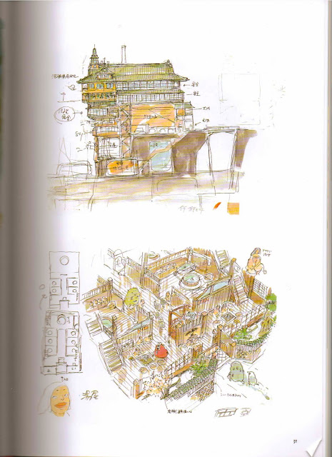
I really love the colour and roughness around the edges in these images, and although there is very little that indicates the location of these buildings, you can still feel that they have a Japanese heritage, which I find really interesting.
I find it really interesting to see how they have drawn out floor plans to express the layout of the building, but then gone into drawing it in different perspectives, showing that they have a really good understanding of animating in 3D space, as well as fundamental drawing skills.
I find this image so striking. Not only because this style of architecture fascinates me, but the attention to detail, especially in the line work which has worked into the block colour. The sky in this image also really draws you in, and you feel as if you are really there looking up at this amazing building. What I love about Ghibli, is that they stay true to what they know, and their heritage and culture, and bring these elements into their work. For my animation I would love to do a similar thing, especially as I am hoping to create a Japanese character, however I feel I don't understand enough of their culture to do it justice, and will only focus on small elements in my design work.
Totoro
I love these beautiful water colours, which show the characters interaction with their environment, especially their feet in the grass in the first image, and how it looks composition wise. I also really love the reflections in both images, making it feel more 'real'.
Who can argue that these images are not beautifully stunning. I cannot believe the attention to detail, they really are masterpieces in their own right. I really like the use of lighting to reflect different moods in each image, and the amount of thought that has gone into the perspective and what is in the distance.
This is my favorite image by far, depicting Totoro asleep in his cave. The moss looks incredible, due to the lighting, shading and tonal work which has gone into the detailing of this picture. The texture and shape of the space itself also make this a wonderful environment to look at. I think this image will probably be the most useful for me to take reference from when creating my characters environment as I am hoping to create a cave house.
Like the last image, these show Totoro's cave, but this time from a different view point. I like how they have shown the 'before and after' as it were, from concept art to screen, to show how the space has been adapted and changed, but still stays true to the original concept.


I have only seen a few of the studio Gibley films,but each one has been a true masterpiece and the painstaking attention to detail brings the narrative to life in such a way as to make them unforgettable.
ReplyDeletevery well described, I feel the exact same way about the studio's work. I think I best try and watch the rest of their collection of animations soon!
Delete